Discover the ease and efficiency of our collection of ready-to-use chart templates. Specifically designed for simplicity and effectiveness, these templates are ideal for quickly creating various types of charts. Perfect for both beginners and seasoned professionals, these templates provide an effortless solution to visualize your data beautifully. Start using them now to transform your data into engaging, clear, and professional-looking charts.
Chart Templates are a practical solution designed to facilitate the visualization of data across various contexts. Their primary purpose is to provide an efficient and straightforward way to create charts that represent data clearly and effectively. These templates are particularly useful in scenarios where quick data representation is needed, such as in business presentations, academic research, or any situation requiring data-driven decision-making. All the Chart Templates available here are the result of thorough research and have been developed in consultation with respected professionals. This ensures that each template not only meets general standards but also addresses specific needs in data visualization. Furthermore, we offer Chart Templates in various formats to cater to diverse user preferences, including but not limited to Microsoft Excel and Google Sheets. Each template is fully editable, allowing for complete customization to suit your specific requirements. With these ready-to-use, adaptable templates, you can easily transform your raw data into visually appealing and informative charts.
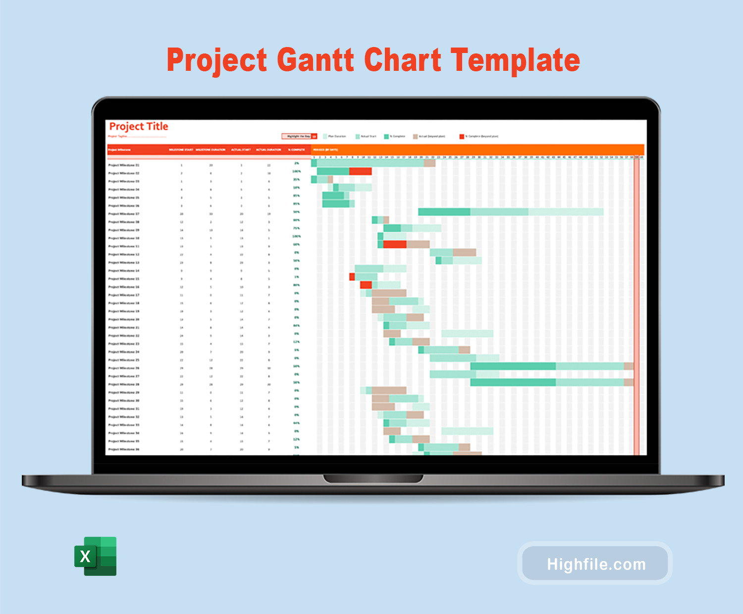
When selecting a Chart Template, consider the type of data you have and the story you want to tell. For instance, use a bar chart for comparisons, a line chart for trends over time, and a pie chart for showing proportions. The key is to match the template with the nature and goals of your data presentation.
Our Chart Templates are fully editable, allowing you to change colors, fonts, and data points. You can also add or remove elements like legends, labels, and titles to suit your specific needs. This flexibility ensures that your chart perfectly aligns with your presentation style and data.
Absolutely! Our Chart Templates are versatile and can be adapted for a range of uses, from business reports and marketing presentations to academic research and classroom projects. Their professional design ensures suitability for various contexts.
To import data, simply open the template in the respective software (like Excel or Google Sheets) and replace the sample data with your own. The charts will automatically update to reflect your data. For large datasets, you can use the import function of the software.
Yes, our templates are compatible with mobile versions of Microsoft Excel and Google Sheets. This ensures that you can view and edit your charts on the go, although some advanced editing features might be more accessible on a desktop.
If you face any problems, first check if you’re using the correct software version compatible with the template. If the issue persists, contact our support team for assistance. We’re here to help ensure your experience is smooth and productive.
To make your chart more accessible, use contrasting colors and add descriptive titles and labels. You can also use alternative text (alt text) for the chart, which describes the chart and its key data points for those using screen readers.
Yes, these templates are ideal for collaboration. If you’re using Google Sheets, you can easily share the file with your team and work on it simultaneously. For Excel, use the sharing features of OneDrive or SharePoint for collaboration.
Always double-check your data before importing it into the template. Ensure that the data format is consistent, and avoid manual entry when possible to reduce errors. Regularly save your work and use version control if working in a team.
We value your contribution, Thanks!