
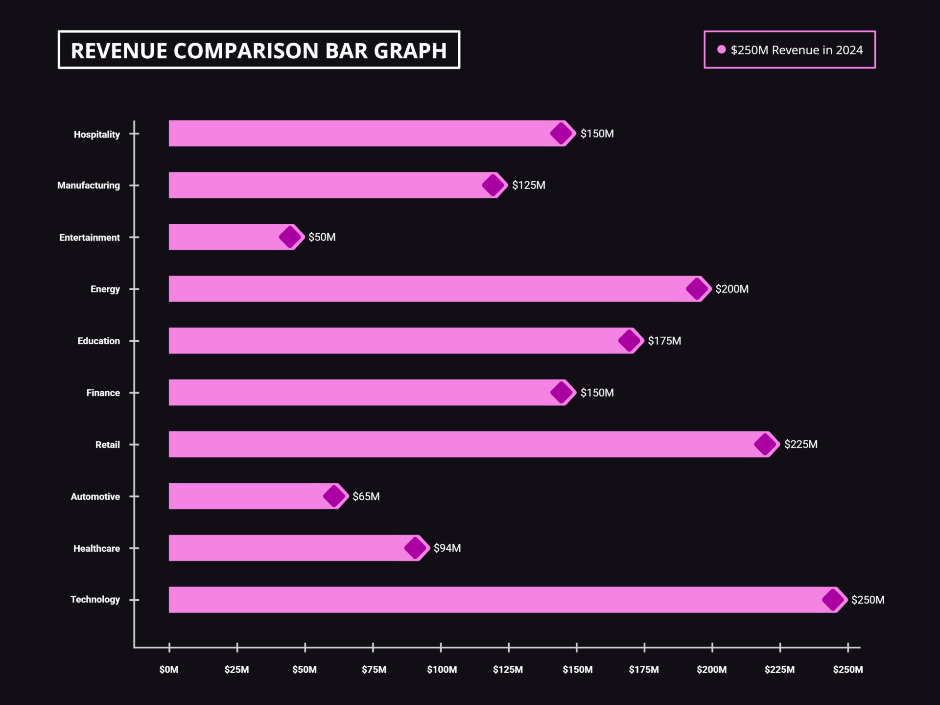
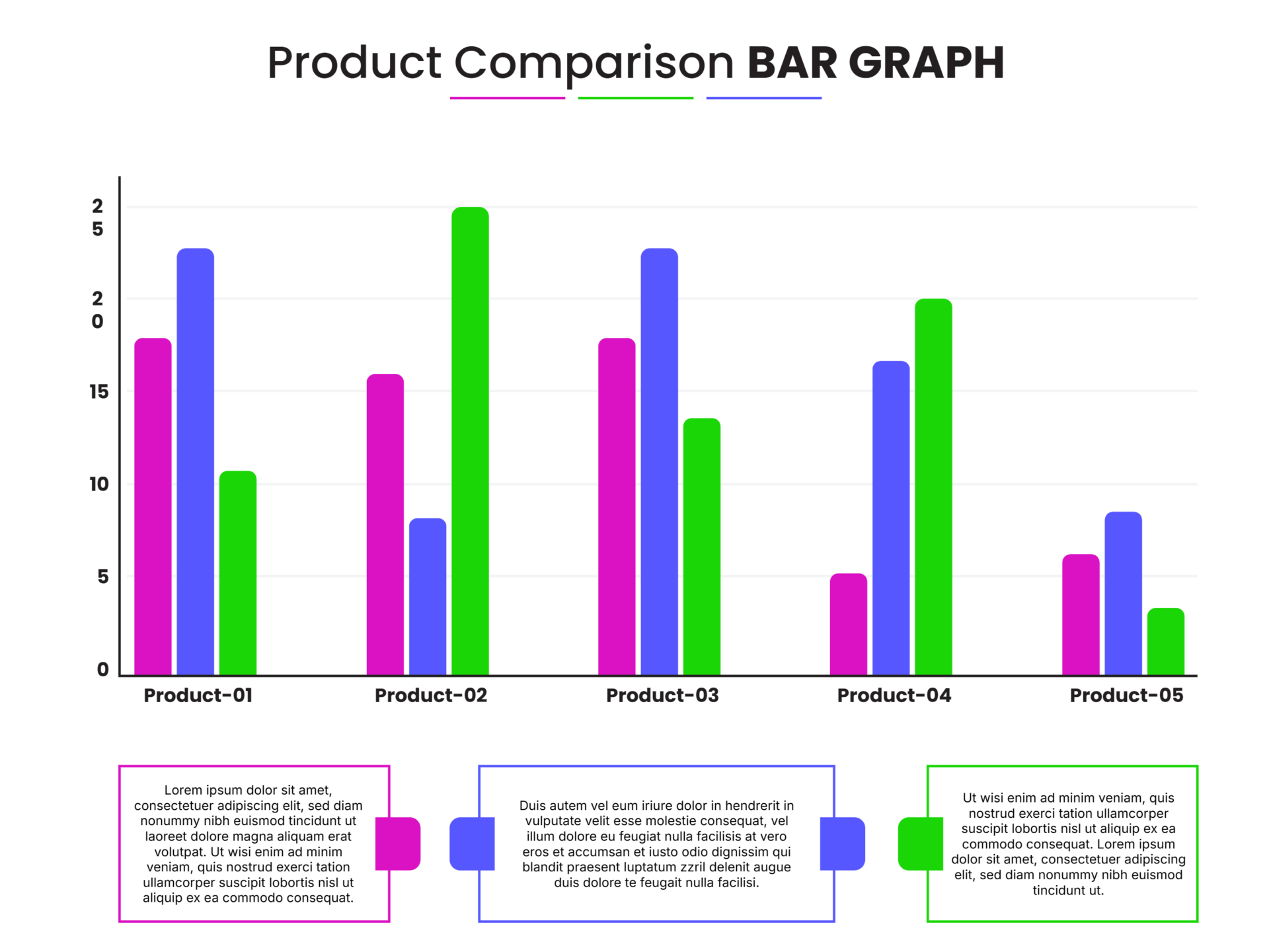
Comparison Chart Templates
When you are choosing between several options and each one has to be judged on the same set of criteria, a comparison chart sets them side by side so the differences are easy to spot. These comparison chart templates give you the item columns and criteria rows already aligned, so you fill in the cells and the strongest option becomes clear. Pick a design and start filling in your comparison.


A comparison chart sets several options side by side and scores each one against the same list of criteria. Items sit across the top as columns, criteria go down the side as rows, and every cell shows how a given option performs on a given measure. The format works because it forces each option to be judged on the same points, so a reader can scan one row to see how all the options compare on a single criterion, or read one column to size up an option whole. That is its real job, taking a decision with too many moving parts to keep in your head and laying it flat enough to actually compare.
These comparison chart templates are built around that structure, with the header row, the criteria column, and the comparison cells aligned so a wide table stays readable as it grows. They suit the comparisons this format is made for, weighing product features or pricing tiers, sizing up vendors or competitors, or putting any set of options against shared requirements. You set the items, the criteria, and what goes in each cell; the design keeps the rows and columns aligned so the comparison reads cleanly even when there is a lot to take in.
Worth knowing: The criteria you choose decide the outcome more than the data you enter. Pick the measures that genuinely separate the options and that matter to the decision, and leave out the ones every option scores the same on, since identical rows add length without helping anyone choose.
Comparison chart elements
The elements a comparison chart is built from, and the job each one does.
The options being compared, one per column across the top. These are the products, vendors, plans, or choices the chart exists to weigh against each other.
The points every option is measured on, listed down the left side. Chosen well, they are the measures that actually distinguish one option from another for this decision.
Where each column meets each row, holding how that option performs on that criterion, a value, a checkmark, a rating, or a short note.
The top row names the items and the first column names the criteria. Together they orient the whole table, so a reader can find any cell by the option above it and the measure beside it.
An optional emphasis on one option, often a recommended or featured choice, set apart by color or weight to draw the eye. Used sparingly, since over-emphasis works against a fair comparison.
A heading above the comparison stating what is being weighed, so the purpose of the table is clear before a reader starts reading cells.
Creating a comparison chart
From a chosen set of criteria to a comparison that points to the right option.
Set the items you are comparing across the top, one per column. Keep the set to the genuine contenders; a column for an option no one would pick only widens the table and slows the read.
Tip — Order the columns deliberately, by price, by preference, or by any logic the reader expects, so the eye moves through them in a way that aids the comparison.
List the measures down the side. This is the step that decides the chart's value, so pick the criteria that separate the options and matter to the decision, not every attribute you could name.
Tip — Drop any row where every option scores the same. Identical rows add length without helping anyone choose between the options.
Enter how each option performs on each criterion. Use the same unit and the same level of detail across a row, so a reader is comparing like with like rather than guessing at the difference.
Tip — Checkmarks and dashes read fastest for yes or no criteria; save numbers and short notes for measures where the actual value matters.
Give every option the same depth of description and the same styling. Uneven detail or one column dressed up in bold and color tilts the comparison before a reader has read a thing.
Tip — Base entries on facts rather than judgments. "100% cotton" can be checked; "high quality" is an opinion that quietly favors one option.
Title the table for the decision it serves. If you are steering toward one option, mark it lightly, enough to guide without overpowering the comparison the rest of the chart is making.
Adjust colors, borders, and fonts so a wide table stays readable. Shading alternate rows or the header band lets the eye track across many criteria without losing its place.
FAQs
What is the difference between a comparison chart and a T-chart?
A comparison chart handles many options against many criteria, which is why it takes the form of a full table. A T-chart compares exactly two sides, such as pros and cons, in two columns. If you are weighing several options on several measures, the full table is the right format; for a straight two-way split, a T-chart is simpler.
How do I keep a comparison chart unbiased?
Base the cells on facts rather than opinions, give every option the same level of detail, and use consistent styling so no column stands out unless you intend it to. Highlighting one option with bold text or bright color creates an advantage a reader feels before reading the data. A second pair of eyes is a good check for unintended bias.
How do I choose which criteria to compare on?
Pick the measures that genuinely separate the options and that matter to the decision at hand. A criterion where every option scores the same adds a row without adding insight. The criteria you select shape the conclusion as much as the data you enter, so it is worth deciding them deliberately before filling cells.
How many options can a comparison chart hold?
There is no fixed limit, but readability sets a real one. Past five or six columns a table starts to crowd, so shading alternate rows or the header band keeps the eye on track. If the comparison is sprawling, narrowing to the real contenders usually serves the reader better than fitting everything in.