
Bar Graph Templates
When you need a reader to see which category is bigger without reading a single number, a bar graph does it in one glance, because the eye compares bar lengths faster than it compares figures. These bar graph templates give you the axes, scale, and bars already aligned, in vertical, horizontal, grouped, and stacked layouts. Drop in your categories and values and the comparison reads itself.


A bar graph compares values across categories using rectangular bars, where the length of each bar stands for its value. Because people judge length quickly and accurately, a bar graph is one of the clearest ways to show which category is largest, how a handful of groups stack up, or how a value differs from one category to the next. The categories are separate and independent, which is why the bars sit apart with gaps between them rather than touching.
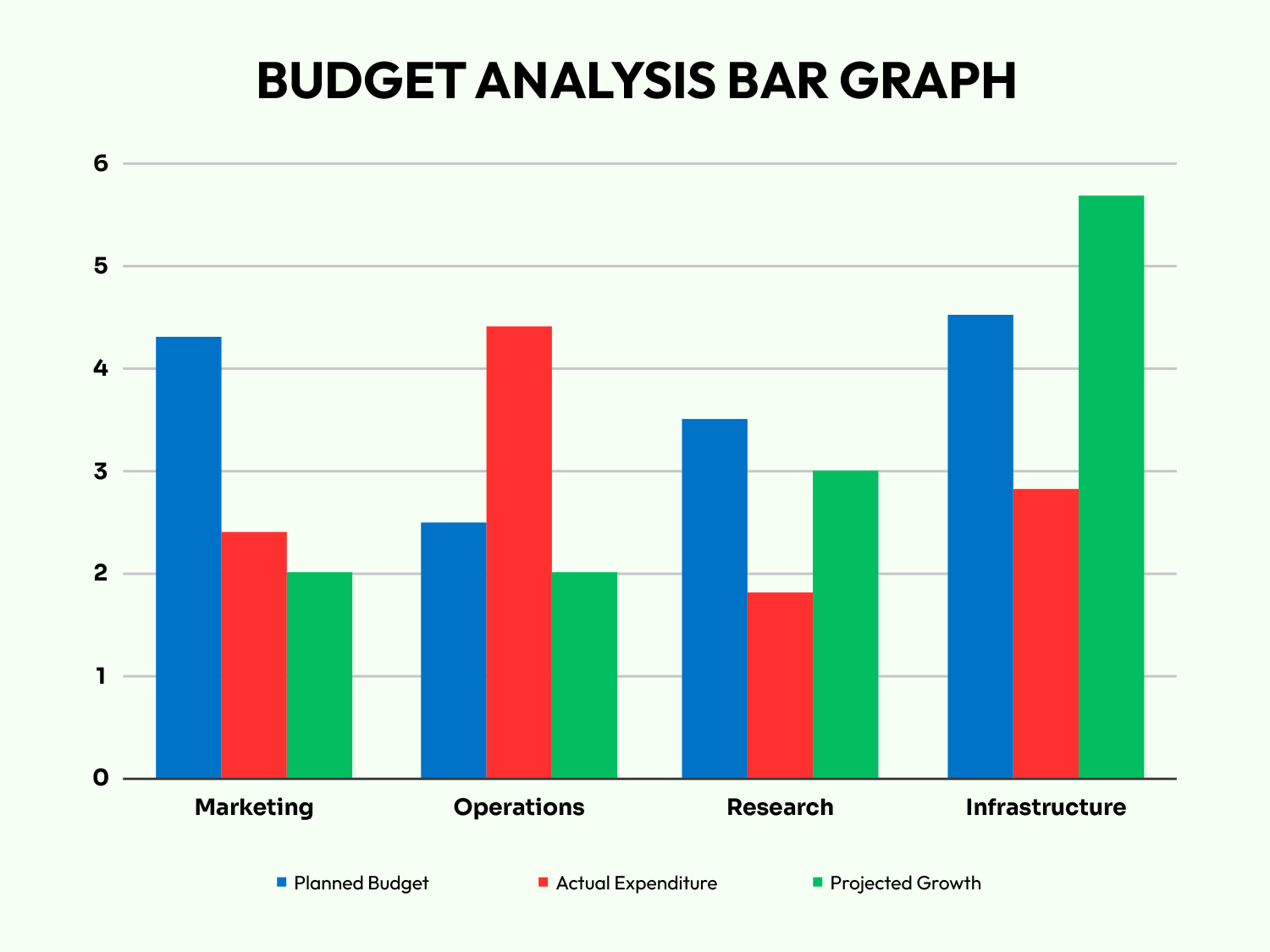
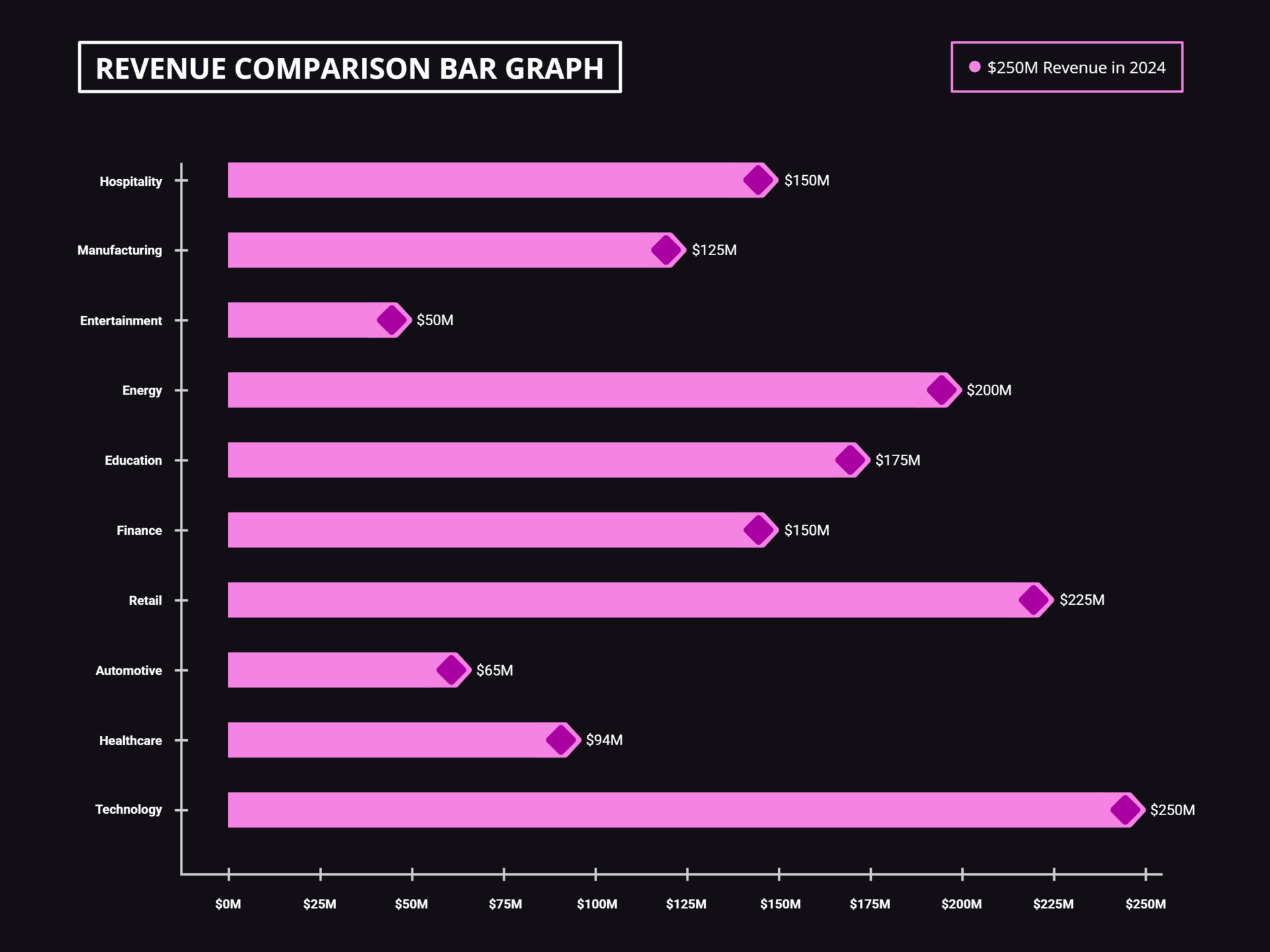
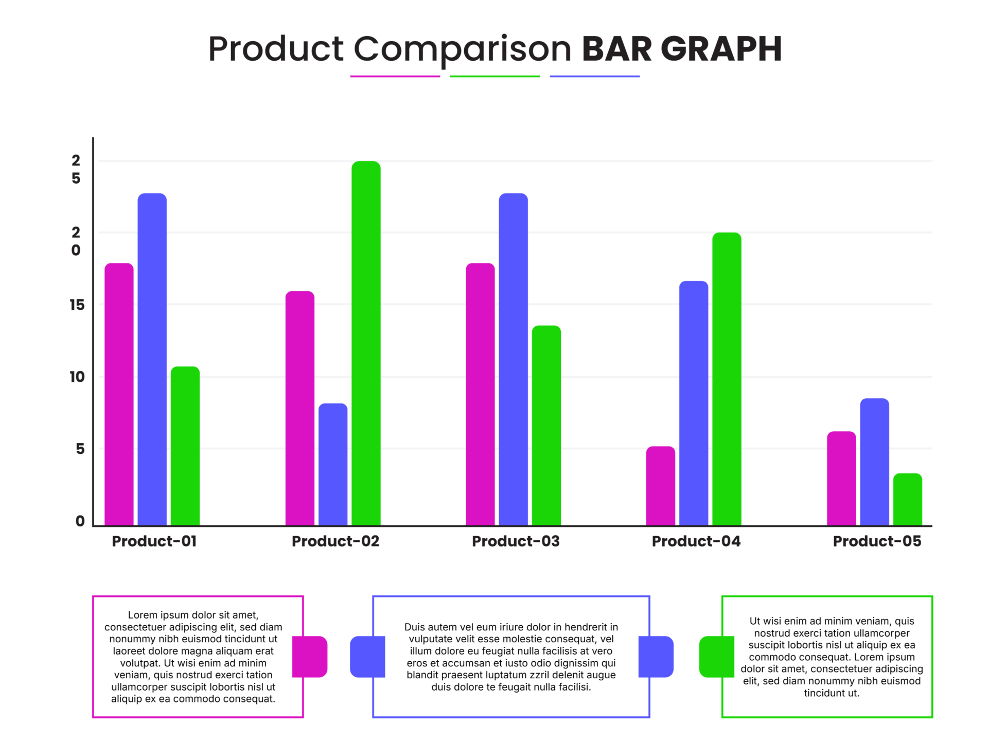
These bar graph templates come in the layouts the format is built around. A vertical chart suits most category comparisons; a horizontal one handles long category names or a longer list of categories; a grouped chart sets several bars side by side to compare sub-groups within each category; and a stacked chart builds each bar from parts to show a total and its composition at once. You set the categories, the values, and the scale, and the bars keep the comparison readable across uses like sales by region, scores by subject, or output by month.
Worth knowing: Start the value axis at zero. A bar's length is the message, so a cropped axis exaggerates small differences and can make one category look far ahead of another when the real gap is slight.
Bar graph elements
The parts that make a bar graph easy to read, and what each one does.
The rectangles whose length represents each value. Comparing their lengths is the whole point of the graph, so they do the real work.
The axis listing the groups being compared, on the x-axis for a vertical chart and the y-axis for a horizontal one. Each bar belongs to one category.
The axis carrying the numeric scale the bars are measured against. It pairs with the category axis and the two swap roles when the chart is horizontal.
The interval marks along the value axis that set how lengths translate to numbers. Starting it at zero keeps the comparison between bars honest.
The key that names each color when a chart shows more than one series, as in a grouped or stacked layout. With a single series it can be left off.
The faint lines running from the scale across the plot area, helping a reader read a bar's value without tracing back to the axis.
The chart title and the axis labels that say what is being compared and in what units, so the graph is understood without explanation.
Creating a bar graph
From a set of categories and values to a comparison that reads at a glance.
Pick vertical for most comparisons, horizontal for long category names or many categories, grouped to compare sub-groups, or stacked to show a total and its parts.
Tip — A stacked chart shows the whole and its composition at once, but exact comparison of the inner segments is hard, since only the bottom segment shares a common baseline.
Enter the groups along the category axis. These are the discrete things you are comparing, like regions, products, months, or survey options.
Tip — Ordering bars from largest to smallest makes ranking instant. Keep a natural order only when the categories already have one, such as age bands or months.
Add each category's value and set the scale on the value axis. Begin the scale at zero so bar lengths stay in true proportion to the numbers.
For a grouped or stacked chart, add each additional series and give it its own color, then add a legend so a reader can tell the series apart.
Name both axes with their units and give the chart a title that states the comparison. A reader should grasp the point without anything explained aloud.
Tip — Value labels on or above the bars let a reader get exact figures while still comparing lengths, which is useful when the precise numbers matter.
Set the colors, fonts, and spacing to fit your report or brand. Keep the gaps between bars so the categories read as separate rather than continuous.
FAQs
What are the main types of bar charts?
Four cover most needs. A vertical chart puts categories on the x-axis and values on the y-axis, the default for comparing groups. A horizontal chart flips them, good for long category names or many categories. A grouped chart sets bars side by side to compare sub-groups within each category. A stacked chart builds each bar from segments to show a total and its breakdown together.
What is the difference between a bar chart and a histogram?
They look alike but answer different questions. A bar chart compares separate categories, so the bars sit apart with gaps. A histogram shows how continuous numeric data is distributed across ranges called bins, so its bars touch to signal that the scale is unbroken. If your x-axis is groups, use a bar chart; if it is a number line split into intervals, use a histogram.
Should the value axis always start at zero?
For a standard bar chart, yes. The length of a bar is what the reader compares, so a value axis that starts above zero distorts those lengths and can make a small difference look large. If the meaningful variation is hard to see at full scale, a different chart type usually serves better than a cropped axis.
When should I use horizontal bars instead of vertical?
Reach for horizontal bars when the category names are long, since they have room to sit beside each bar rather than being squeezed or angled under it. Horizontal also reads more comfortably when you have many categories or want a clear ranking from top to bottom. Vertical bars remain the natural choice for shorter labels and time-ordered categories like months.
Can these bar graph templates compare more than one set of data at once?
Yes. The grouped layout sets several bars within each category so you can compare sub-groups side by side, and the stacked layout shows each category’s total alongside its breakdown. Some of these templates also pair two charts in one view for a direct side-by-side comparison. Each added series takes its own color and a legend so the groups stay easy to tell apart.