
T Chart Templates
Some decisions come down to two sides, pros against cons, this option against that one, and a T-chart is the cleanest way to set them next to each other. These T-chart templates give you the title bar, the two column heads, and the dividing line already in place, so you fill the two lists and the balance between them shows. Pick a design and start filling in your two sides.





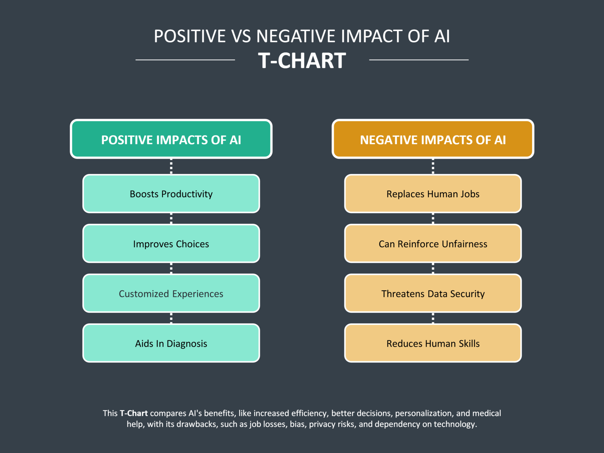


A T-chart is a two-column diagram, named for the shape the title bar and the central divider make on the page. It does one thing well, setting two opposing sets of information side by side so they can be weighed against each other directly. Pros and cons is the classic pairing, but the two columns work for any clean split, advantages and disadvantages, before and after, one option against another, or facts on one side and opinions on the other. The value is in the constraint. Limiting a comparison to exactly two sides keeps the thinking focused on the one decision being made, instead of sprawling the way a longer list tends to.
These T-chart templates are built around that two-column structure, with the heading, the column titles, and the dividing line set so the two sides stay visually balanced as you fill them. They suit the everyday comparisons a T-chart is made for, deciding between two choices, contrasting two ideas in a lesson, sorting points into two categories, or working through a problem from two angles. You set the two headings and the items under each; the design keeps the two columns even so neither side looks weightier than its content deserves.
Worth knowing: A T-chart with five points on one side and one on the other can mislead at a glance, since a reader reads length as weight. If the sides come out lopsided, that may be the honest answer, but it is worth checking that the short side is genuinely thin rather than just under-thought.
T-chart elements
The few elements a T-chart is built from, and what each one does.
A heading across the top naming the comparison, such as "Pros and Cons" or "Option A vs. Option B," so the purpose of the two columns is clear at a glance.
A label at the top of each side naming what that column contains. These two heads define the split the whole chart is built on, so they set most of its meaning.
The vertical rule down the middle, the stem of the T, that keeps the two sides cleanly apart. It is what makes the comparison read as two distinct columns rather than one block of text.
The entries down each column, the actual content being compared. Kept to short, parallel points, they let a reader scan one side against the other line by line.
Filling in a T-chart template
From two well-named columns to a balanced two-way comparison.
Set the two column headings first, since they define the split. Make them a true pair, two halves of one comparison, so every point you add belongs plainly under one head or the other.
Tip — If you find yourself wanting a third column, the comparison has outgrown a T-chart and a full comparison chart will serve it better.
Add a heading that states the decision or contrast the chart is for. A reader should know what the two sides represent before reading a single entry beneath them.
List the points down each side. Keep entries short and phrased in parallel, so a reader can scan one column against the other rather than reading each as a paragraph.
Tip — Where a point on one side has a direct counterpart on the other, place them on the same line so the contrast reads across, not just down.
Look at the two sides together. Length reads as weight, so a heavily one-sided chart should reflect a genuinely one-sided case, not a side you simply thought about less.
Tip — For a pros and cons decision, a lopsided chart is often the answer itself; for a teaching contrast, even sides usually make the better exercise.
Adjust the colors, fonts, and column widths to suit the subject. Giving each side its own accent color keeps the two columns apart for a reader as the lists grow.
FAQs
What is a T-chart used for?
A T-chart compares two sides of something directly, pros and cons, two options, two points of view, or any clean split into two categories. It is common in decision-making, classroom exercises, note-taking, and quick problem analysis, anywhere a comparison comes down to two sides and benefits from seeing them next to each other.
When should I use a T-chart instead of a comparison chart?
Use a T-chart when the comparison is genuinely two-way, two options or two categories. The moment you have a third option or several criteria to score each option on, a T-chart runs out of room and a full comparison chart fits better. The T-chart’s strength is its limit, since holding to exactly two sides keeps the thinking focused.
Do both sides of a T-chart need the same number of points?
No. The two sides reflect whatever the comparison honestly contains, so an uneven split is fine and sometimes is the conclusion. The thing to watch is that a short side is short because the case is thin, not because it had less thought. A reader tends to read a longer column as the stronger one.
Can a T-chart compare more than pros and cons?
Yes. Pros and cons is the best-known pairing, but the two columns work for any two-way split, before and after, advantages and disadvantages, one method against another, or facts against opinions. As long as the content divides cleanly into two headings, the format fits.