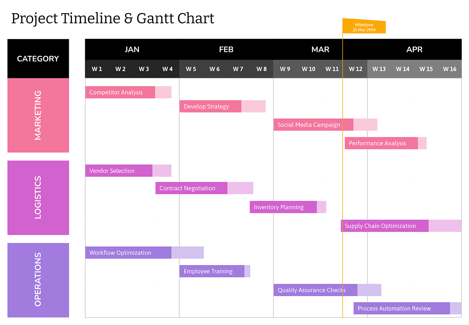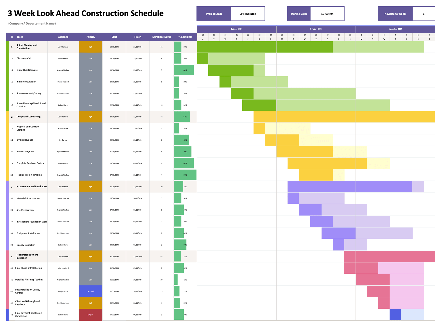


A four-year Gantt chart becomes useful when a project is too long for a short timeline to explain properly. Once work stretches across several phases, annual budgets, review cycles, contract periods, or rollout stages, a short-term chart often stops being enough. You may still know what needs to happen, but it becomes harder to see how early tasks connect to later work, how long each phase will stay active, and where projects begin to overlap across months or years. That is where a longer timeline becomes important. It gives you room to plan work over a wider period and check the full schedule before dates begin to conflict or drift.
This 4 year Gantt chart template is designed for long-range planning in Excel and Google Sheets. It is intended for projects that continue over several years and need a month-by-month timeline that stays readable during planning, review, and revision. You can use it for capital projects, implementation schedules, expansion plans, research programs, product development, grant-funded work, construction planning, or any other multi-stage project that cannot be understood properly through a short chart. Instead of focusing on daily scheduling, this template places the emphasis on duration, timing, overlap, and sequence across a four-year period. Here is a closer look at how to use it effectively.
Start With the Timeline Date
Begin with the start date field at the top of the template. This date controls the beginning of the four-year calendar shown across the chart. The month labels for Year One through Year Four follow that starting point, so this should be decided before anything else is entered.
This is especially useful when your planning period does not begin in January. If your project follows a fiscal year, an academic year, a contract term, or a grant cycle, place that start date here so the calendar reflects the period you are actually managing.
Add the Main Project Names First
Each highlighted project row is meant for the name of a larger initiative. Think of these rows as the parent level of the schedule. They are there to show the full span of a project, while the rows beneath them break that project into smaller tasks.
This is helpful when you need to discuss the schedule at two levels. A manager or client may want to review the overall project span first. Your internal team may need to look further down at the individual tasks driving that schedule. Keeping both levels in the chart makes that review easier.
Enter Task Titles With Specific Wording
Under each project row, enter the task titles that make up the work. These task names should be specific enough to remain meaningful months later. A broad entry such as “Planning” can become confusing in a long schedule. A more exact title such as “Vendor Review,” “Permit Submission,” “Pilot Phase,” or “Internal Approval” makes the task easier to identify during later reviews.
This matters more in a four-year chart than in a short schedule because the chart is likely to be reviewed repeatedly over a long period. Specific task names reduce ambiguity and make status discussions easier.
Use Start and End Dates to Drive the Timeline
The chart bars are based on the start date and end date columns. For each task, enter the date the work is expected to begin and the date it is expected to finish. The timeline area then highlights the matching months for that task across the four-year grid.
This is one of the central functions of the template. You are not manually drawing bars across the chart. The visual timeline is linked to the entered dates, so when task dates are revised, the bar placement updates with them. That keeps the schedule aligned with the planning data instead of relying on manual formatting.
Review the Days Column as a Duration Check
The “# of Days” column calculates the length of each project or task based on the dates entered. This gives you a direct duration count instead of relying only on the visual length of the bar.
That number becomes useful during schedule review. A task may look short on the chart but still cover a long period if it crosses several partial months. In another case, two similar tasks may appear close in length but have very different day counts. Reviewing the duration column helps you catch those differences early.
If the day count looks wrong, the first thing to check is the date entry itself. A mistaken year or reversed date can distort both the duration and the chart bar.
Understand the Project Summary Formula
The main project row is not only a label row. Its dates are tied to the task dates beneath it. The project start date reflects the earliest task start date in that section. The project end date reflects the latest task end date in that section. The project duration is then calculated across that full range.
This means the project bar acts as a summary of the tasks below it. If a task is pushed later, added, shortened, or removed, the summary row changes with it. That function is useful in long-range planning because it saves you from recalculating the full project span every time a task changes.
Read the Monthly Grid for Overlap and Sequencing
The chart is divided into monthly blocks across four years. That makes it easier to review how projects and tasks line up over time. Instead of looking for daily detail, you are looking at broader timing. You can check when phases begin, how long they remain active, and where several pieces of work collide within the same period.
This is helpful during planning meetings, budget reviews, staffing discussions, and progress updates. If too much work lands in the same stretch of months, or if one phase appears before a related task should reasonably finish, the chart makes that easier to catch.
Keep Related Tasks Under the Correct Project
Each task group should stay under the project it actually belongs to. That sounds obvious, but long schedules often become messy after several updates. When unrelated tasks are dropped under the wrong project row just because there is open space, the project summary dates become less meaningful and the chart becomes harder to trust.
If one project outgrows the visible task rows, it is better to expand the editable sheet or continue that project on another tab than to mix unrelated work into the same section.
Update the Timeline During Reviews
A four-year schedule should be treated as a working chart, not a one-time setup. Dates often shift after approvals, procurement delays, staffing changes, scope revisions, or funding changes. Since the timeline bars are date-based, updating the schedule usually means revising the affected dates and then reviewing how those changes affect the project summary row and surrounding tasks.
That makes the template useful during both planning and active execution. Early in the project, it can be used to draft timing. Later, it can be revised as actual project conditions change.
Where This Template Is Especially Useful
This template is designed for long-term planning where work continues across multiple years and needs to be reviewed at both project level and task level. It is especially suitable for phased implementation plans, construction schedules, grant timelines, strategic initiatives, system rollouts, and expansion programs.
It is less suited to daily production tracking or highly detailed dependency control. In that case, this chart can still be used as the higher-level planning version, with a separate operational tracker used for short-term coordination.
Wrap-Up
This template is available in Excel and Google Sheets. You can rename projects, adjust task groupings, change colors, expand the sheet for additional rows, and set the timeline to any start date that matches your planning period. It is built to be revised. Dates change, phases shift, and schedules evolve, the template is designed to handle that without breaking. Keep your date entries accurate, save a baseline before major revisions, and it will stay reliable through the full life of the project.